
Learning Care
Love to Learn
Over 1,100 schools. A presence in 40 states. Nearly 60 years in business. But that’s not what matters. As impressive as those stats are, they’re not what made Learning Care Group special. They’re not why teachers showed up every morning with smiles on their faces, nor why school directors worked tirelessly to attract and engage families. Learning Care Group built a wildly successful business around early childhood education — but the ‘business’ isn’t the main story. The real story is simpler, yet more powerful. It’s a story about dedication, passion, and love. And we knew the best way to tell it was to start with a small but impactful change to the name: we dropped the ‘Group.’ Here’s how we transformed a decades-old brand into a more vibrant, more human, more loving Learning Care.
Services
Brand Research
Brand Strategy
Brand Architecture
Brand Voice
Visual Rebrand
Environmental Design
Photo & Video Production
Conference Theme & Design Production

Brand Strategy and Architecture
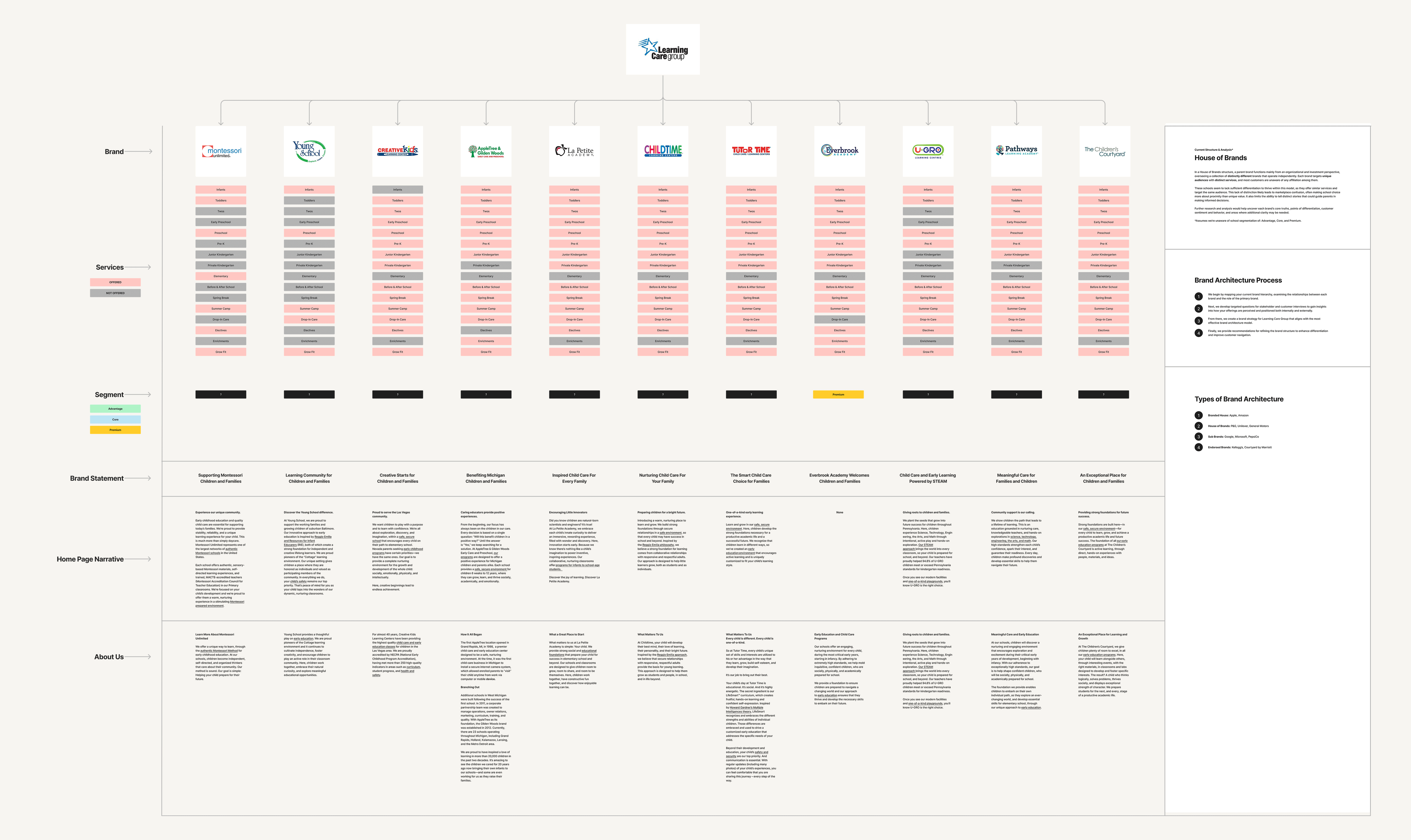
Learning Care’s schools largely share the same curriculum — but have operated under more than a dozen independent brands. This has led to confusion for customers (families may tour multiple schools without realizing they’re all part of Learning Care) and unnecessary stress for Learning Care’s marketing team, who had to manage an overflowing cornucopia of brands.
Research
Our recommendations were supported by a deep foundation of research. We conducted an owned assets and materials review, stakeholder interviews, multiple school visits in different states, a quantitative survey of district managers, a family (customer) review analysis, web analytics review, and a competitive analysis. This ensured that every decision we made, both strategic and creative, was backed up by solid evidence.
Brand Voice
We crafted a new brand voice with the goal of making families feel the same way Learning Care classrooms make children feel: safe, supported, and inspired. Composed around the attributes of Trustworthy, Empowering, Optimistic, and Nurturing, the voice brings renewed energy and compassion to internal and external communications, engaging employees and families alike.
Brand Narrative
Learning Care’s previous narrative highlighted the brand’s various accomplishments, but lacked any sense of the passion and energy that its teachers and other employees bring to their work. So we set out to create a new narrative that spoke to the heart of Learning Care’s story, a story built on love.
For the love of learning
For all the reasons to do what we do, all the proven value that comes from a strong early childhood education, there is one simple, succinct word that speaks to our why: love.
Love for the smiles that greet us every morning on the faces of our students. For the chance to make a positive difference in the lives of children and parents. For the communities we support and the future we build together.
It isn’t lost on us that our work is a privilege and a responsibility. We’re entrusted to write the first page of a child’s education story and send them forward into the next chapter of their lives, full of promise and potential. It’s work that brings us the greatest joy — and that hasn’t changed since we opened our first school in 1967.
Now, after decades of experience and with a nationwide presence, we haven’t lost track of why we’re here. And as we reach more families, our approach, our standards, and our mission only grow stronger.
As does our love.
Visual Brand
We developed an energetic and welcoming new logo that serves as the cornerstone of Learning Care’s new visual identity. Clear, confident, and composed of instantly recognizable shapes, it’s a symbol of what the company stands for and represents its legacy of education and care — and the love that Learning Care educators bring to their work every day. The four graphical elements that make up the logo — square, triangle, circle, and heart — can also be used independently to creatively express the brand.
We further refined the visual identity with a harmonious color palette. Composed of primary colors, tonal modulation, and neutral tones, it’s designed for warm, engaging, and accessible learning environments across digital, print, and school interiors.
For typography, we selected Cocogoose Pro as the display typeface, reflecting the warmth, clarity, and confidence at the heart of the brand. Its friendly geometry and clean structure lend the typeface an approachable and modern feel that is distinctly Learning Care. Cocogoose Pro Text, our selection for a text typeface, brings clarity and readability to body copy across the Learning Care brand. Its clean lines and balanced proportions maintain the characteristics of Cocogoose Pro while ensuring longer passages of text feel effortless to read.
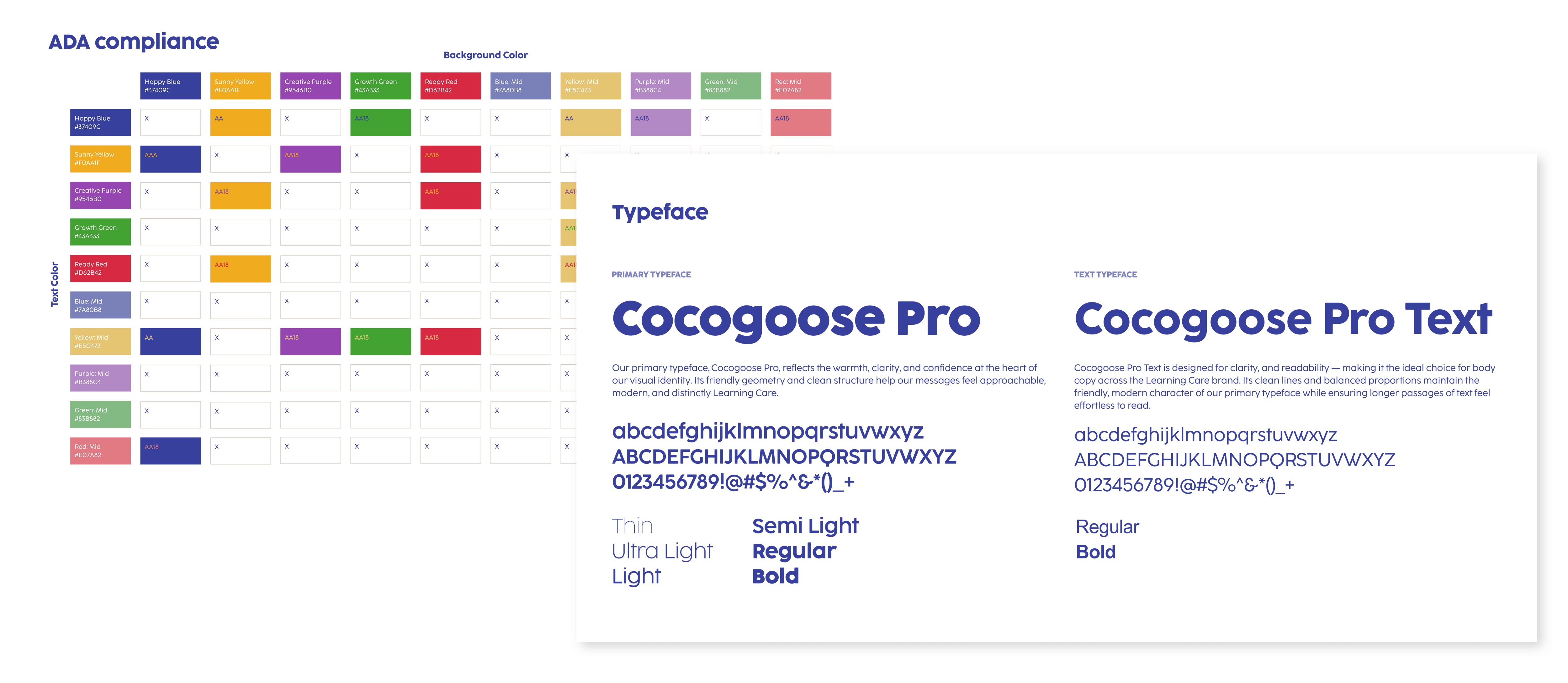
Photo & Video Production
Learning Care has always championed its people — the teachers and directors who make its schools successful — but we knew we could help them level-up how they demonstrate this. We produced a series of short documentaries with simultaneous photo shoots to accompany Learning Care’s annual conference and Teacher and Director of the Year awards. This content is now used across the Learning Care brand, expressing the brand’s love and humanity through real teachers, directors, and students.


3D Character Development
A particularly fun part of this project, we created human and animal characters that serve as reflections of the children who attend Learning Care schools, bringing the brand to life through relatable childhood moments. Each character has its own personality and captures the joy, curiosity, and boundless energy of young children.
These characters are full 3D models rendered at cinema quality, elevating the brand value while keeping it fun, approachable, and light-hearted.


Testimonials
“Building a new corporate identity, focused on building culture from the inside out, is not an easy task. From research to final creative execution, the Devise team was a partner who was able to understand, flex and achieve great results.”
Sean SondrealChief Customer Officer - Learning Care