Acre
Places of Possibility
Established in 1963, General Office Products has been a force in the Minneapolis and St. Paul workspace design community through multiple evolutions of the office. As one of the exclusive Steelcase furniture distributors in the twin cities, GOP’s core competencies have traditionally aligned with commercial interior furniture, fixtures, and equipment (FF&E), with added expertise in workplace strategy and design. In an increasingly fragmented and competitive market, there was an immediate need to bring GOP’s brand voice and visual identity into a more progressive light.
Services
Research and strategy
Brand naming and anthem
Brand voice
Visual Identity Suite
Approach
Nothing short of an entirely new brand would suffice to address everything GOP now offered beyond “office products.” That meant starting where we always do with branding exercises: research. We spoke with stakeholders, analyzed competitors, put the NPS score under the microscope, and gathered insights from our work with other clients in the industry in the Portland and Seattle markets. This informed a brand strategy that laid the foundation for our creative and ensured every move we made was supported by data and formed a cohesive new vision.
Research
The bulk of our research came from two exercises: stakeholder interviews and a competitive analysis. We spoke with both internal and external stakeholders to piece together the public perception of the brand, its services, and Steelcase partnership. Then we took a deep dive into the brands of five major competitors, analyzing logos, color palettes, typography, and brand voices to uncover opportunities for the newly-branded Acre to stand out.
Development
As a name, General Office Products had equity and history behind it, but it no longer described what the company did. Sticking with a descriptive name wouldn’t work — the company’s current services were simply too broad — so we leaned heavily into expressiveness. Hence, Acre. It evokes an image of openness, expansiveness, and freedom of creativity — qualities that led us right into the new brand anthem: Places of possibility.
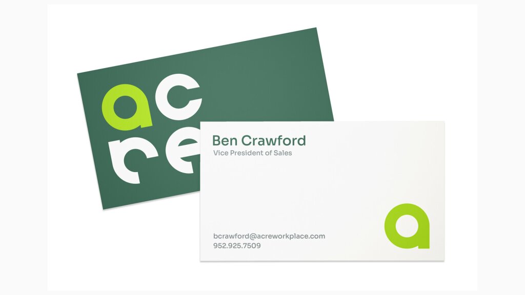
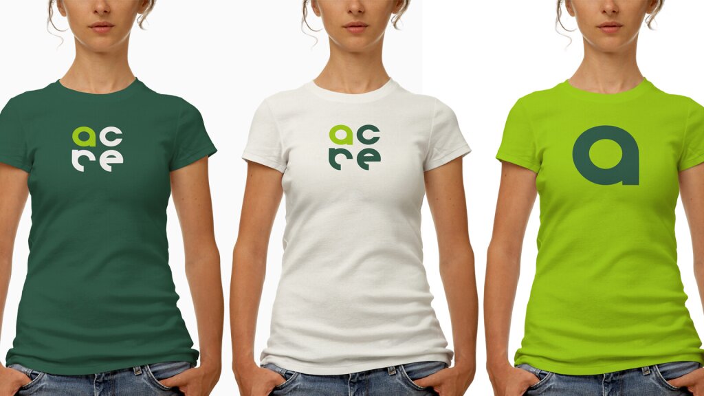
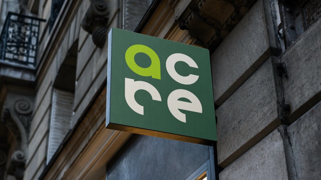
This was supported by a completely new brand voice and visual identity suite. The result? A radically fresh look and feel that no longer limited how the brand would be perceived by customers.
Testimonial
“The Devise team got to know our organization, customers, and local market prior to starting on the brand voice, naming, and visual identity. We truly appreciated this, because it is so important to have a genuine approach in our industry. They took a dated brand and helped us create something fresh while preserving what is great about our history as well as our employees.”
Ben CrawfordVP Managing Director - Acre